Job Search Data
Part of the point of this post is that tomorrow I am attending open session interviews with Tableau, the company that makes the program (Tableau Public) I used to create these little infographics.
I also thought it might be interesting to other people who were currently searching for jobs and struggling with long-term unemployment (or at least longer term than they’d like) to see how someone else’s job search was going.
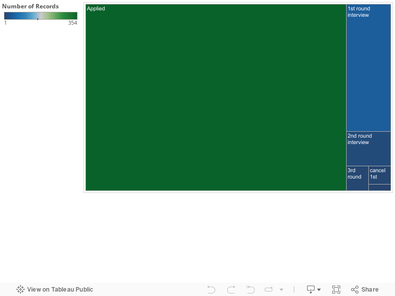
The first graphic is pretty basic- just the number of jobs I have applied to and the number of 1st-4th round interviews I have then had.
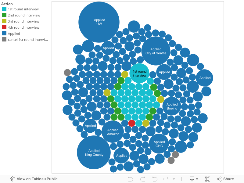
The second graphic then breaks out that information by organization I have applied to.
The third removes organizations, but puts in the month/year information, so you can see how my job search activity has changed since I first learned I would be losing my position back in December.